Tuesday 15 December 2015

Visual Forms: Repreposal

Repreposal


Just a reminder there are many layers to this module the main part is a research diary and a presentation on a specific topic and the second part is an unrelated sketchbook on a chosen topic from: Ruined civilisation, Market Places or Processions.

Part 1


I was looking at the aesthetics of the art David Mack and his link to the Netflix shows Daredevil and Jessica Jones. I do have a bit of research on these but far as my research has got me it is still not enough to fill my research diary, I have also been warned of not turning it in to a fan letter to Marvel comics and David Mack. I will keep it but i am widening my range to the colours used in setting and how they are comparable to the comic books and Lighting and touching a little bit on semiotics. This has been a bit of a set back for me, I still have the prior research I did but it is just need a re-word and it is due January.

Part 2 


My original proposal for my sketchbook was to look at ruined civilisation in games, mainly looking at backgrounds and setting to start off with then develop in the character design. However, chatting to my lecturer it is clear it is more about -actual- first hand visual studies. Not a research sketchbook in to already done concepts. I can link my research that i find into games and concepts towards the end but fundamentally the core of my sketchbook has to be first hand visual sketches and ideas.
So my new proposal is keeping in mind that I was going use Fallout as my main inspiration i am going to be studying war and as secondary; 50's culture.
My plan is to get into a war museum which would be perfect if i was at my home over the break for a while being as it is very close to a WW2 museum. I am going to have to look in to museums in the area.
I plan on starting off by looking at typewriters and technology that is rarely used nowadays, perhaps uniforms and weapons that are now modified and then the horrors of war and then perhaps some of my own concepts and then some research into artists that have studied this topic before.

Below are some shots from Fallout that were the main inspiration for my research.


Monday 7 December 2015

Advance Animation Techniques: Update #2

UPDATE #2

 06/12/15
 As I have already mentioned, I restarted the the project the other day because the lines weren't  correct and I started to colour in the line layer, so i made the judgement and it was easier to just start again. I think it has gone well actually although I had a minor panic attack last night about the build up of work I have to get done besides university work.
For my own background I wanted to replicate the same techniques I learnt for the template backgrounds: using channels and textures mainly as I have found it a very useful skill to know.

Research for Own Background

I have had a few ideas for my own background. My first proposal for a background however was; on different layers of asatate paint scenery and stick photographs of buildings that i have tweaked with a wash of colour or ink. Although i didn't get any further with this idea.

I started off by taking a few photographs of Newport at night time. I was planning on doing a cityscape with photographs and handdrawn and painted drwaing, I was thinking in an scratch acrylic style, due to the photos that I took looked quite blurry (camera quality on my phone) but I liked the way they looked, they almost seemed like impressionist paintings.


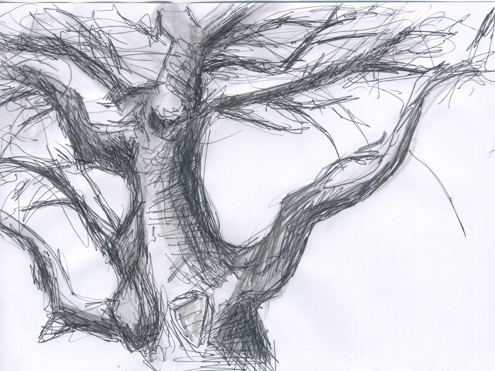
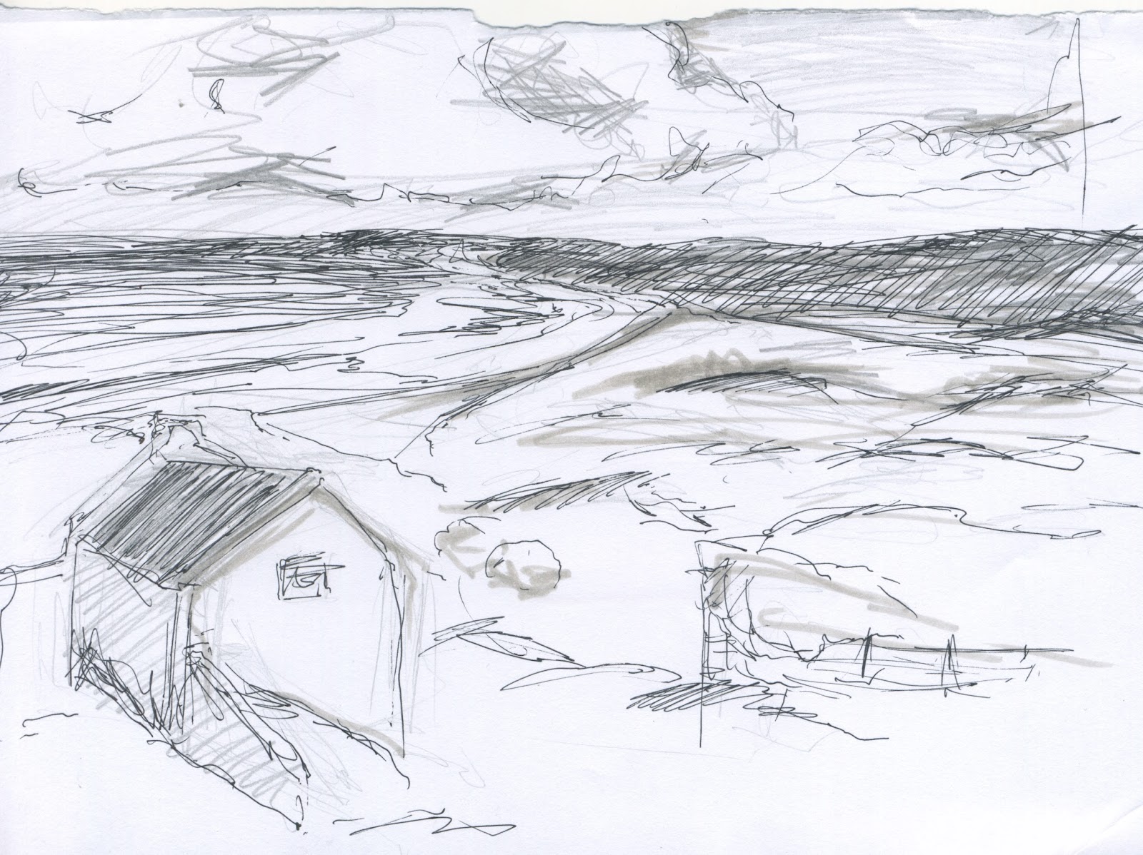
On the subject of cityscapes, I drew the view from Newport city campus cafetria, I mainly looked to see how far into the distance I would see, rather than the details. It was quite an overcast day too.


I also had another idea that I would make a layered background in a traditional medium. I did two experiements with this, they both turned out quite nice:


<This one is acrylic paint on asatate. There are four layers: Bushes, park & trees, city skyline, and the sky.

>This one is on tracing paper, I really do prefer this one more. It is based on the overcast day I had in Newport, hence the monocrome colours. The layering up on the tracing paper worked really nice interms of creating distance too.


My third idea was to make a line background in a digital format and then colour the sections with different textures that would match, for example: the trees woulf have a bark texture, the leave would have a leaf texture etc. I desided i would try it but using substitue texture instead to leave an impression rather than a photograph of hte actual thing.

Here are some photographs that were going to be my textures:


I perposely chose things with a neural colour for two reasons; if i wasn't going to have a colour layer over hte tope, it would be interesting to see how I can use opacity to creat the background. If a did use a colour layer over the top it wouldn't be to drasitc to make the photograph greyscale and turn them into an overlay giving hte background a more "collage-y" feel.
I still want ot try this on out, I will attempt it over the holidays.

My Own Final Background 

My final background is based on a dream I had; it was a volcanic island and the earth breathed and out of holes in the ground came these fumes,  the earth slowly raised up and down. I think it would be quite interesting to animate actually. I will proably attempt to do it in the furture, although I am not sure of the best software that would work for it currently.

Here is my original mock up of my final piece:


My Final Drawing :


I did this digiatlly, much like the background templates we had to colour. I felt replicating the skills I had learnt in a similar format would be a good option for time management and practise.  

I had been recommended by some class mates that I look up The Good Dinosaur that was recently released as it has a similar thing. But I would porbably have to go watch the movie to get a good grasp of it, google didn't turn up any images either. With such short notice it was pretty unfeesable.


" TO-DO LIST

Just needed to check the lines of my day background, I have to scan in my research and Noah Bradleys work was inspirational- I wanna be that good. "

07/12/15 - 12:39 pm


Template Backgrounds:
I changed the line colour for the background layer to mimic the ones on the brief. I don't think my line looks as clear so I duplicated it to make thicker black lines and asked peoples opinion; the lines I had already done  (the mimic ones) looked the best apparently so I will stick with this.

Thick black lines. Not the one I went with.


My Final Designs 


Day Background with mimicked lines.


Night Background

I first completed the Day Backgorund then I worked on the Night Background - but I didn't use the hue and saturation technique as shown in the tutorial, I did it in the same way as the day background; Picking the colours and section myself to colour and altering the shadows slightly. This is why I have so many layers in photoshop and it looks a little hectic.
I did try and change the colours of the completed day background to look like night but it was very purpley and there wasn't much else within my knowledge to change it from that.


The textures I used for the overlay were also a little bit of an experiemnt:


B&W Acrylic, Brush. Not used- too harsh.


Watercolour paper, I used this.

Black & White acrylic, scraped. Used.

Conclusion


I thought this project was a success, I had a lot of setbacks but ultimatly I am happy with the outcome. I wish I did a bit more background research but I will be doing more of that over the holidays in my spare time.
Things I would of like to improve on; agian time management seems to be a biggy with me, it may be due to my inexperience with the software that sets me back, but that can be improved on. Also I would like to work on my quality of line, I am still not 100% happy with the lines I cleaned up. But I did my best for now. 


Tuesday 1 December 2015

Advanced Animation Tehniques: Background Update #1

Update!

So I have been using PhotoShop from my last post.
There is a full log of my day working on the backrounds. A little update on that log; I have been working on pretty much the same things today (01/12/15) but .....it went completly wrong;
I started drawing in a line layer and I couldn't go back and unsure how to fix this and with my frustration I have restarted the project completly. Hopefully I am going to acheive more than average now I have had a bit of practice.
I have redone my lines and my selections, using channels much quicker and effieciently this time. Not perfectly but a lot better.
I have also labeled everything much more clearly -hopefully avoiding the last mistake I made.
I am to colour them now then I can add shadows and highlights, I have until the 7th so 6 days!! I am feeling some full days in the uni room coming on..

Advanced Animation Techniques: Backgrounds

Brief

 For this project we are given a template of a background and two versions of it coloured in; a day scene and a night scene. We are to replicate this to the best of our ability, we can put our own very subtle flare on it- as long as it looks industry standard.

Research

As for the research of this project, I have set out and drawn some backgrounds before the project was given to us, my target was 10 but I got 3:


 The images are more experiments- being as if or the past few weeks I have been working in a digital format, as a traditional artist I thought I would use layers in my backgrounds in my sketchbook. I like the effect, but they don't look very professional. I think I need to go back when I have a little free time to make some more professional looking ones but using the same and other techniques.


My research will be on going through this project; I plan to look at actual animation backgrounds to gain an understanding of what makes a good line.

We also did some drawing form the projector in university here are my sketches!

I feel this is the strongest in terms of prospective.

This one was prety hard to draw, due to a fish-eye lense.


Log

23/11/15 - Throughout the day I just noted my thoughts and where my head was at at he time. I was in university from 10:00 - 19:00.

I have been doing the clean up on the background templates today, I have tried it multiple times now just to try and get it right. I have been struggling to understand what make a good line, I will be looking at other animation backgrounds later to learn more.

I am getting better at PhotoShop now, I have memorised all the shortcuts !! So that is something.

Note to self: it would be a whole lot easier to do clean up if the uni computer screens didn't have greasy finger prints on.

The pen tool is great for selecting an area like the trees in the background, due to the ability to curve the line.

I've tried really hard to get the lines correct because it is something I feel I need to improve on I often have a very feathered line due to preference, practise and ease.

I have now figured out how to use the bevel line on the pen tool- keep the "ears" from the node on the line you are drawing around then when the line is drawn it doesn't over compensate the curve.

I have been working my way form the back to the foreground but a useful thing I have discovered is to do the actual background- in my case the sky- last, because the rest of the then coloured in picture will highlight the white spots to colour in.

I have already learnt so much from this project, I can't wait to apply it to my own work.

Note to self: missed a stripe in one of the trees, that needs to be fixed.

MAKE SURE YOU ARE IN THE RIGHT LAYER ! AARRGHH!

Actually, the channel feature that have just learnt is pretty useful when you botch something up- phew. But I do have to go back and fix some lines now. Not really sure how.

Double tapping with the paint bucket tool fills small gaps, the more you know!

Now that I have coloured the day colours, I still feel my lines aren't clean enough. On the upside I am getting the hang of PhotoShop.